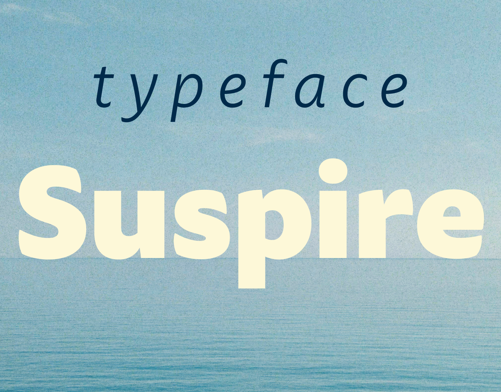
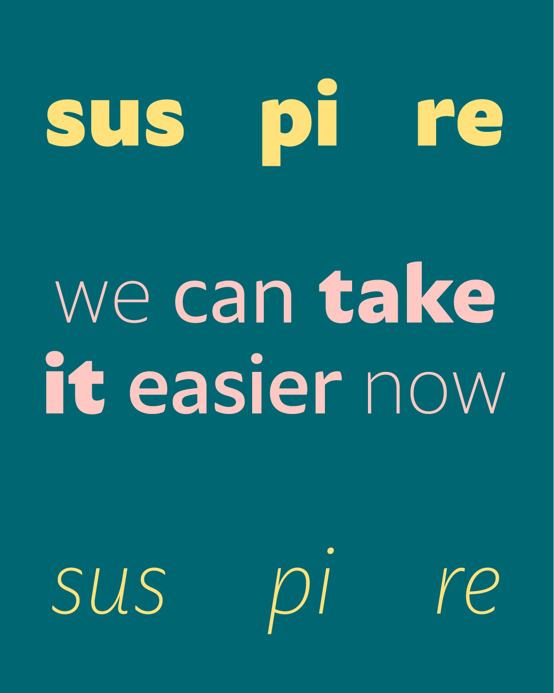
Sus pi re (‘Sigh’ in Portuguese).
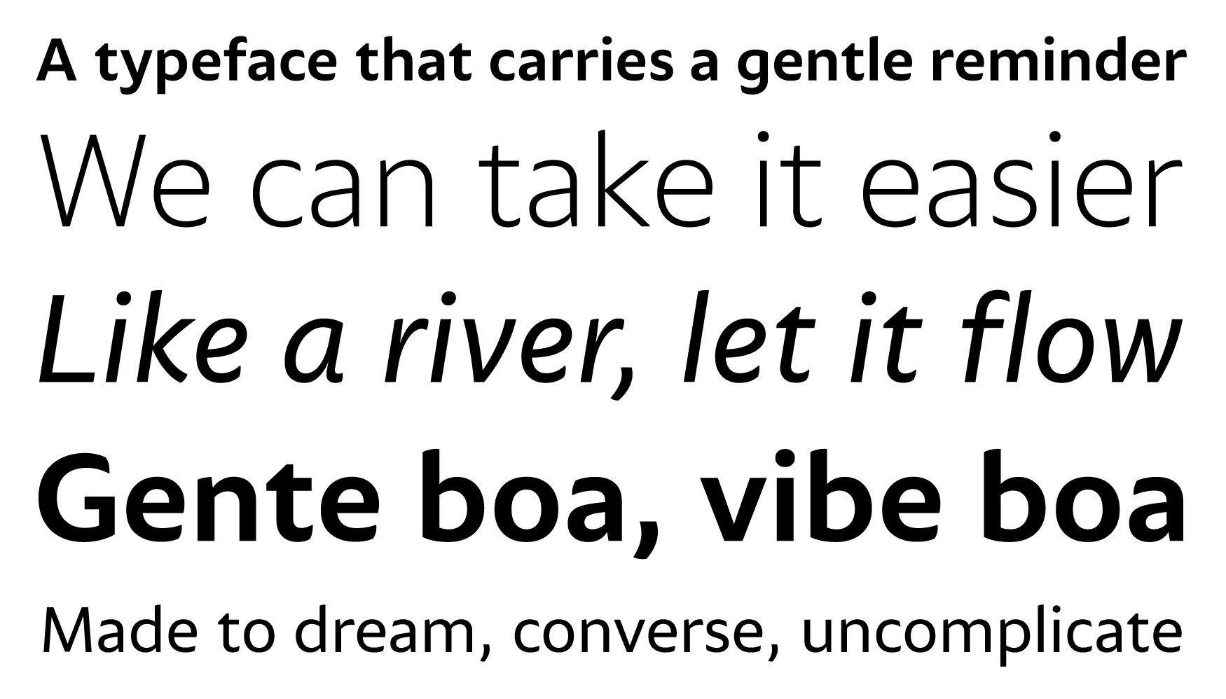
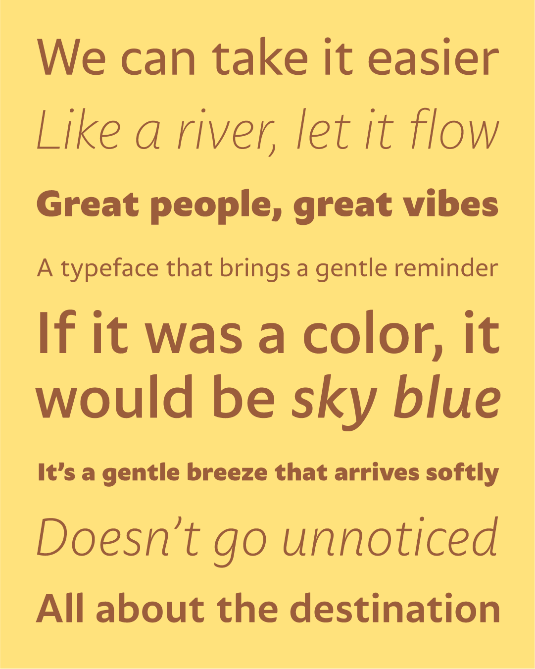
A typeface that carries a gentle reminder:
we can take it easier.

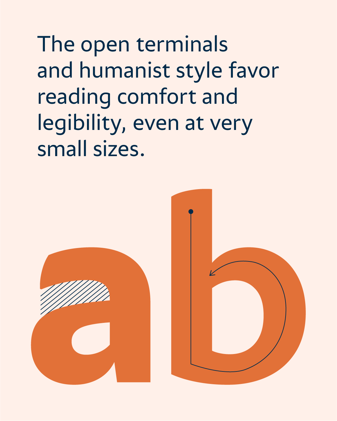
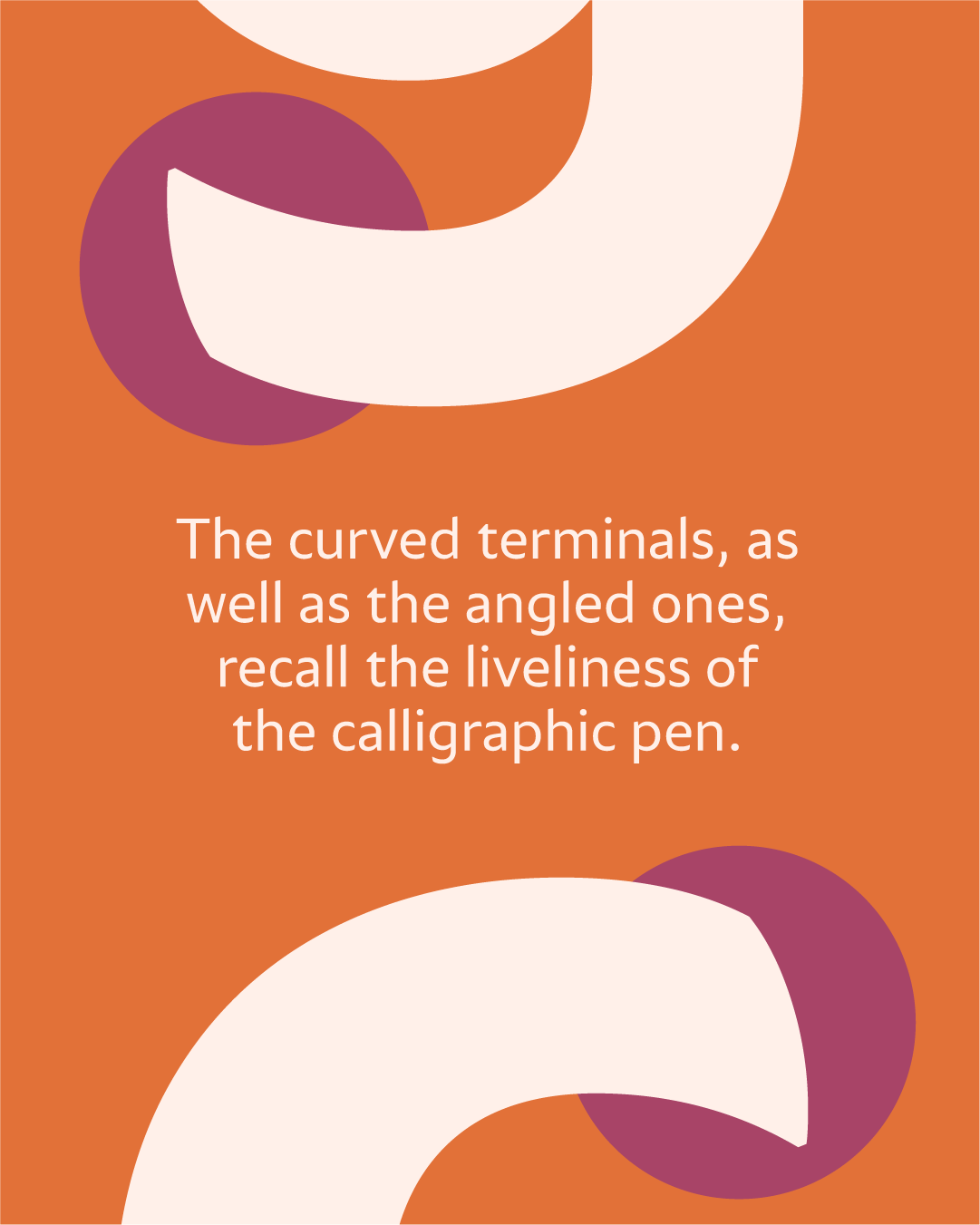
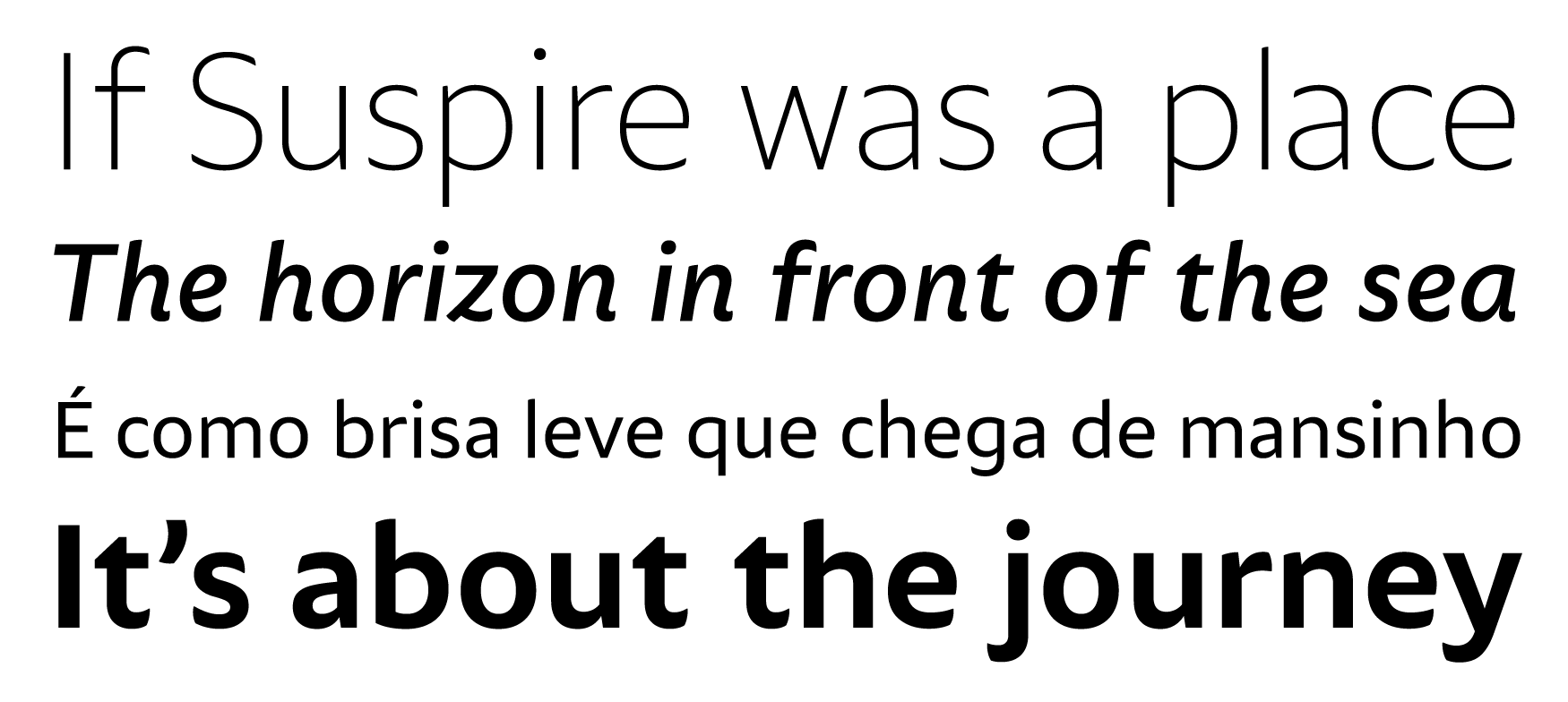
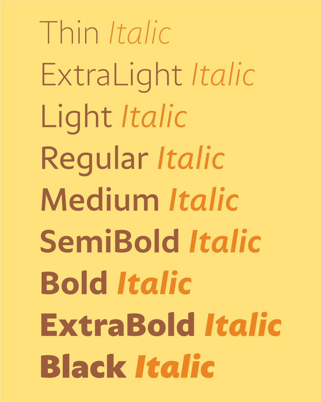
Suspire has the balance that brings people closer: the humanist style, on a sans-serif base. To bring comfort even in small letterforms. The warm terminals, from calligraphic gestures. To converse with the lightness of the hand that writes in a beautiful fit to shine.
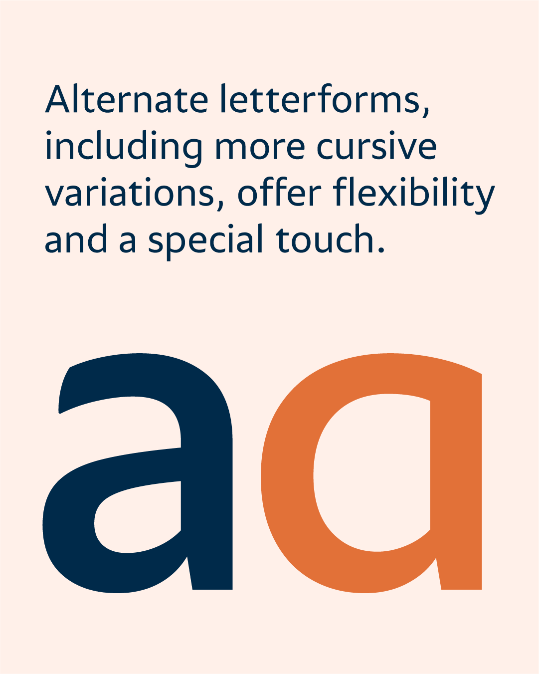
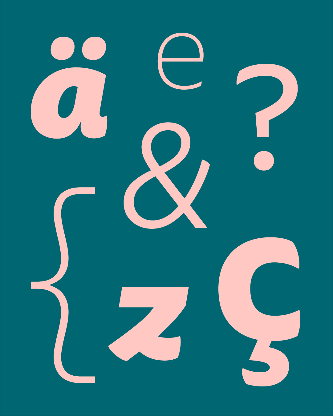
Some letters have stylistic variations, to show the personality of someone who invites everyone to conversation. Suspire doesn’t shout, but if you stop to look, it has presence. Its curved details give an air of grace as the weight and size increase. It’s like a gentle breeze that arrives softly, but without going unnoticed.
Suspire is like us. Made to dream, converse, uncomplicate. It’s meant to be like humans are: creative, empathetic, real. Because being human, in fact, is stopping to sigh.
Ah. That happy sigh we give when we find the type that matches the project’s vibe. A type that reminds us how good it is to let go. Suspire. So the good vibes stay in the air.
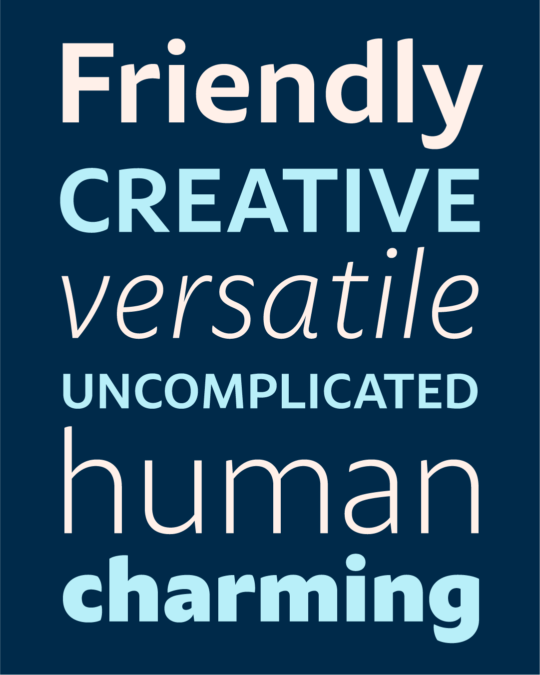
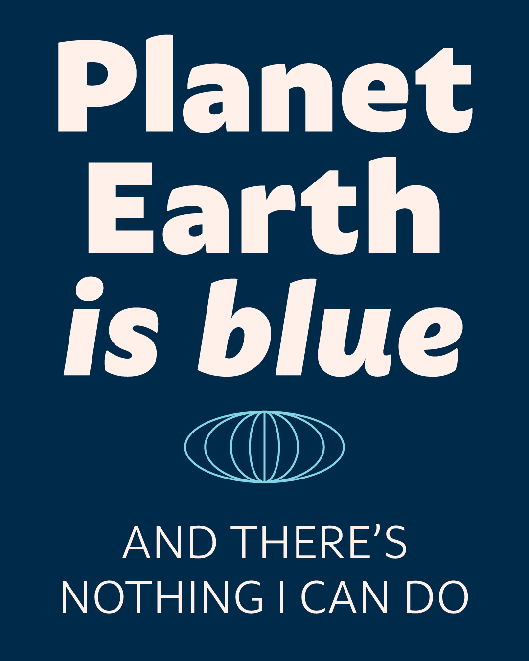
Suspire works best for brands that need to balance professionalism with warmth and approachability.
It’s ideal for wellness and lifestyle brands, creative agencies, technology companies that value what makes us human, and premium consumer brands that need sophistication with warmth.

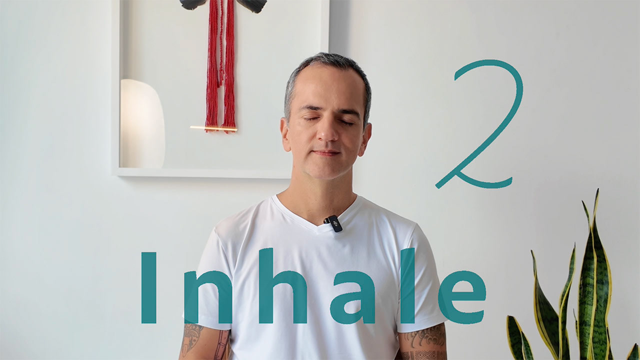
Only this month, the Individual License for the complete Suspirefamily is available at USD $112.50 (25% OFF) — but only if you complete a breathing exercise 🙌
Designed by 🧑🎨 Henrique Beier and developed between 2024 and 2025 as an evolution of his 2019 project Dona, Suspire embodies the balance that brings people closer together.
A special thanks to 🎨 Kalany Ballardin for this mindfull graphic design, to ✏️ Joe Sebastiany at Hunting Words for the inspiring copywriting, and to 🧘Will Gama at InspireSom for the graceful breathing exercise that resonates on all of us.

May your week move at your pace ☀️