Neutrox
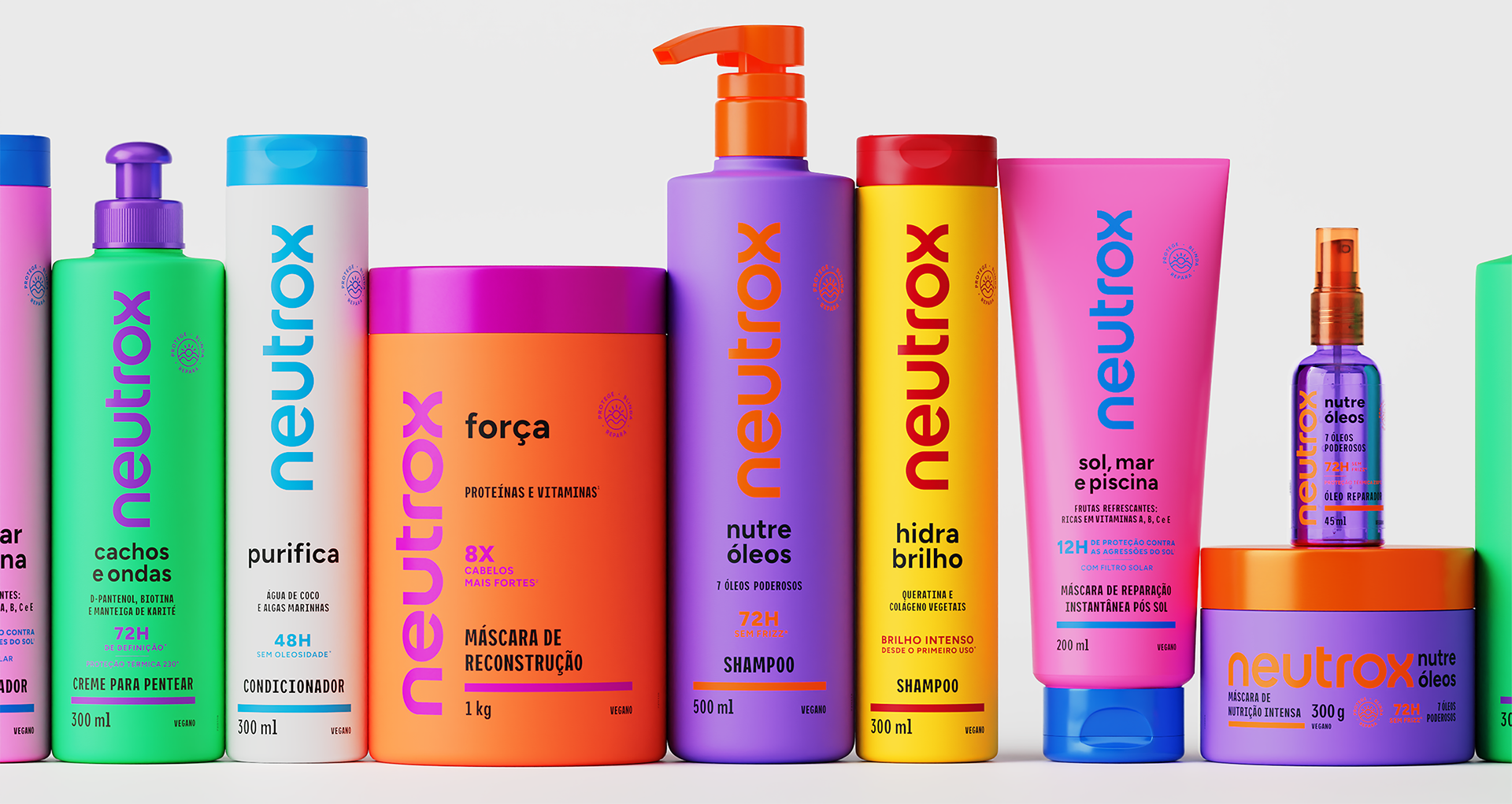
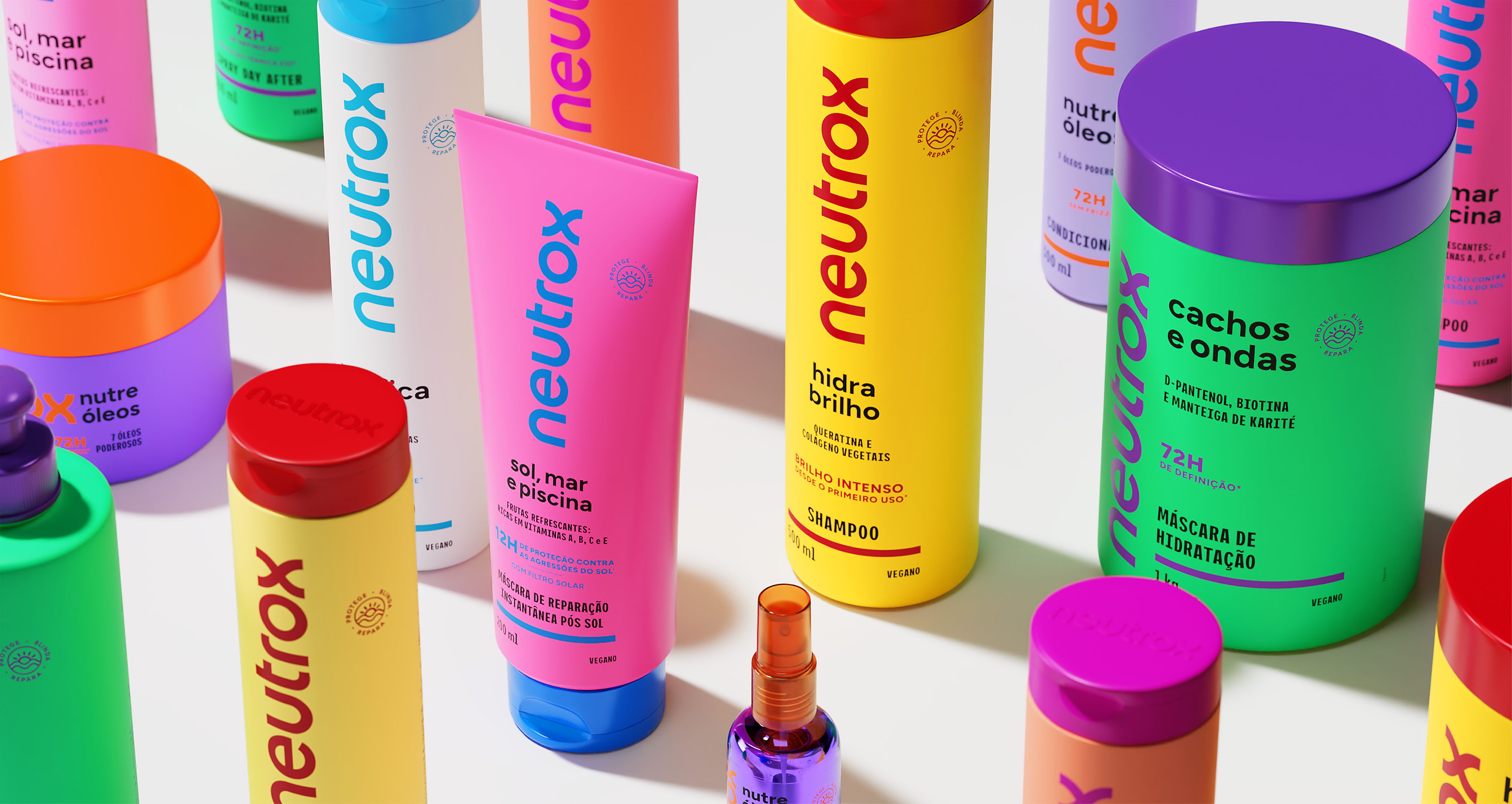
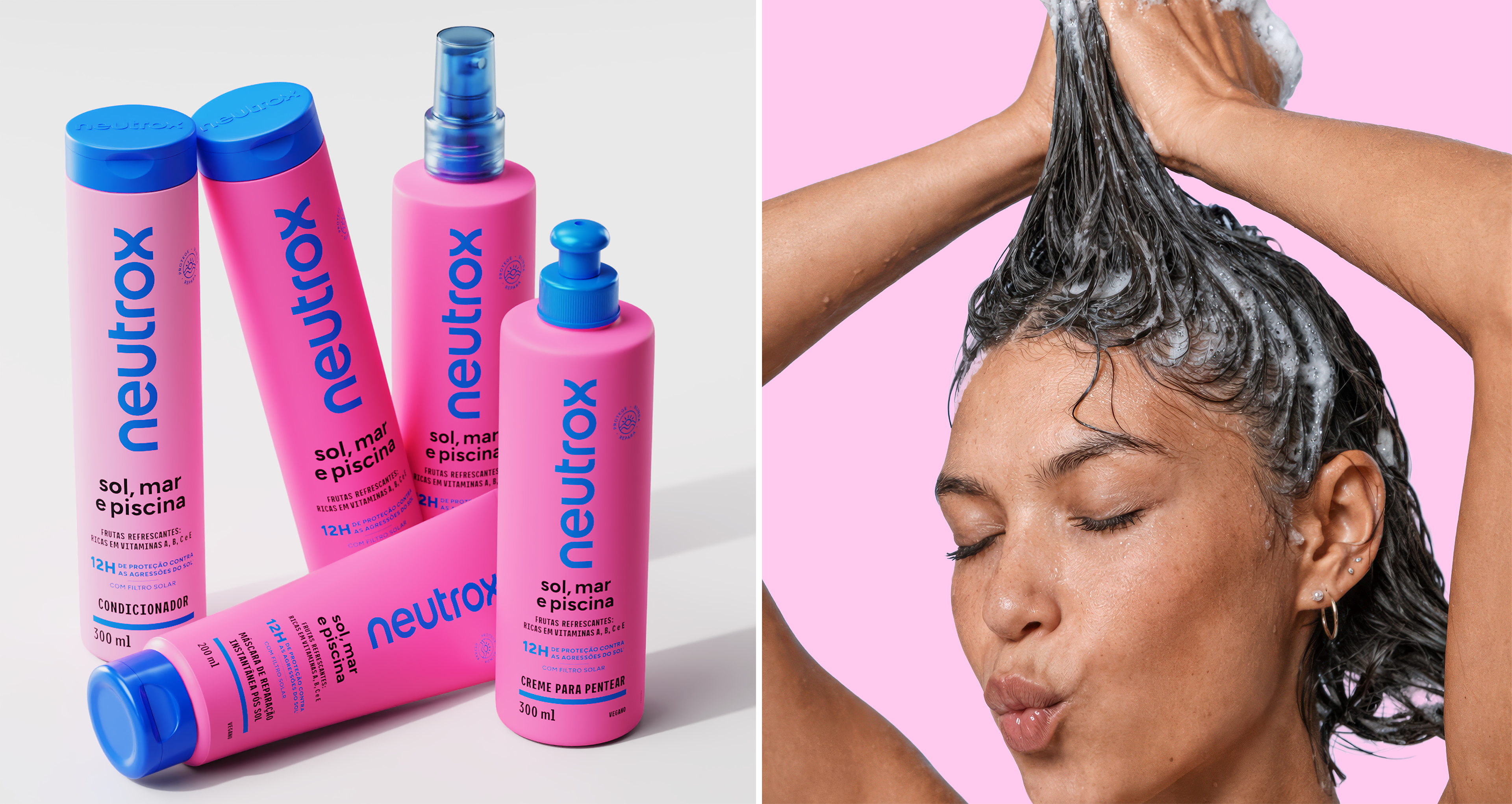
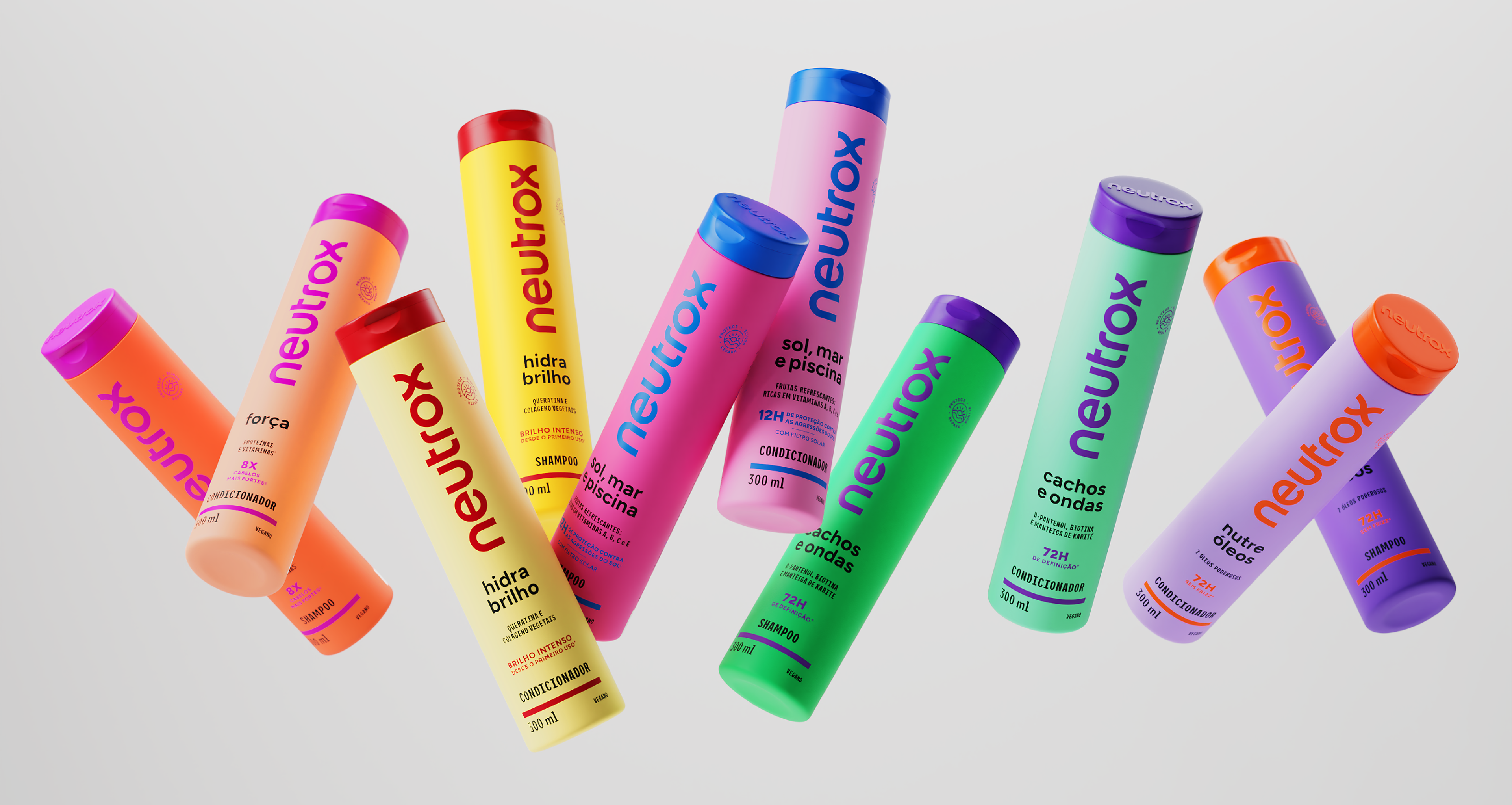
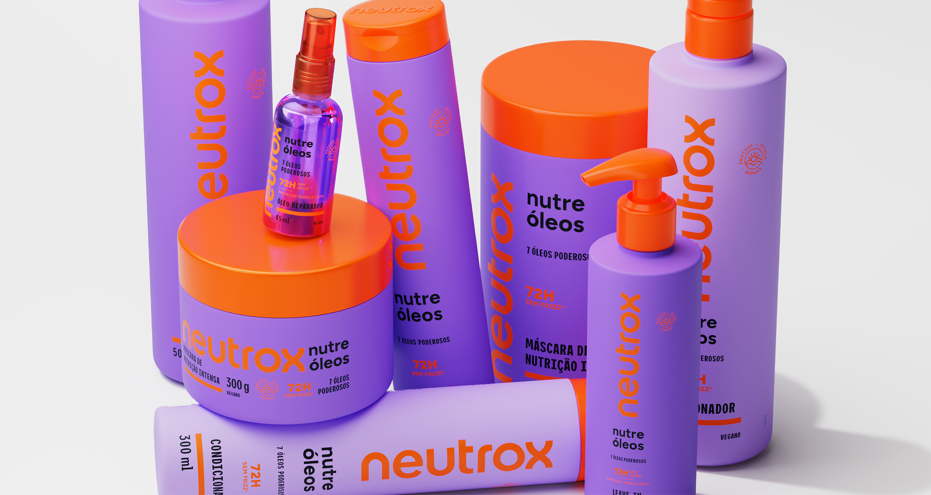
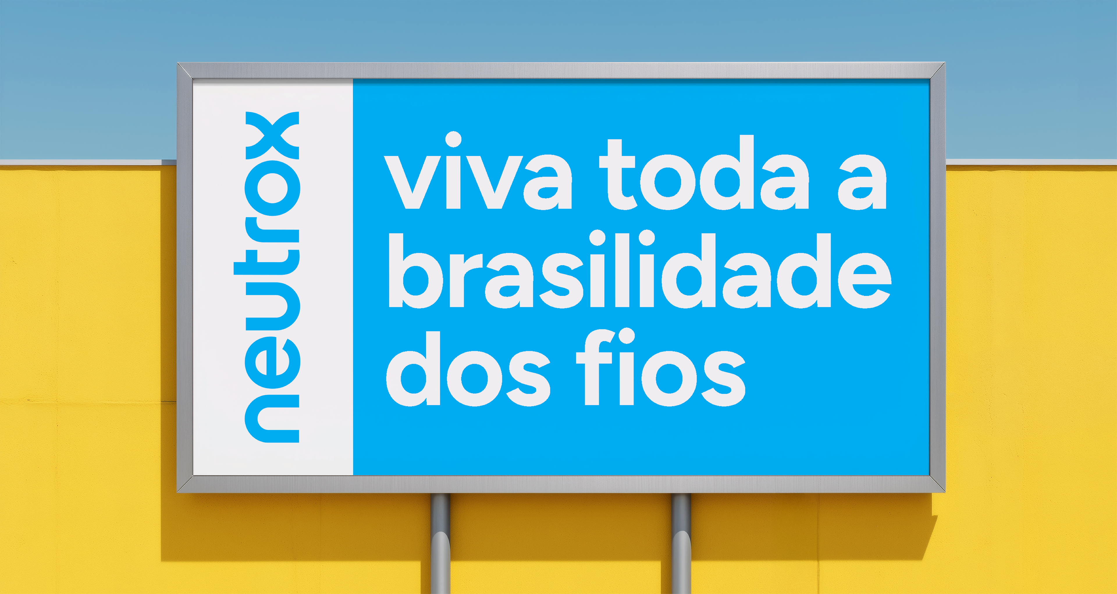
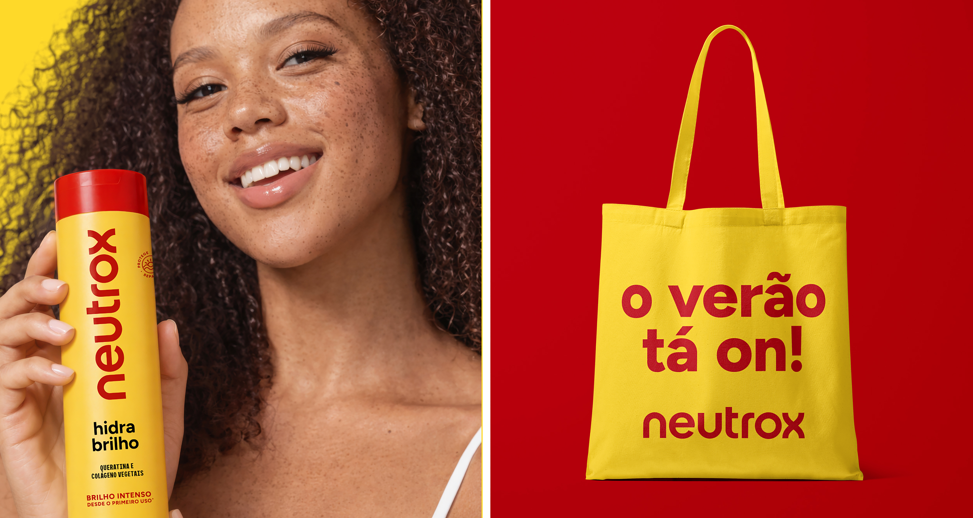
A Neutrox é uma das marcas mais icônicas do mercado brasileiro de cuidados capilares. Lançada no final dos anos 1970, ajudou a popularizar o condicionador no país e tornou-se parte da memória afetiva de gerações. Ao longo das décadas, passou por diversos redesenhos e expansões, chegando hoje a várias linhas com dezenas de embalagens. A Foresti Design foi convidada a redesenhar a marca, a identidade e todo o sistema de embalagens, reorganizando o portfólio e criando uma base atual capaz de diferenciar os produtos no ponto de venda e reposicionar a Neutrox como uma marca mais desejada.
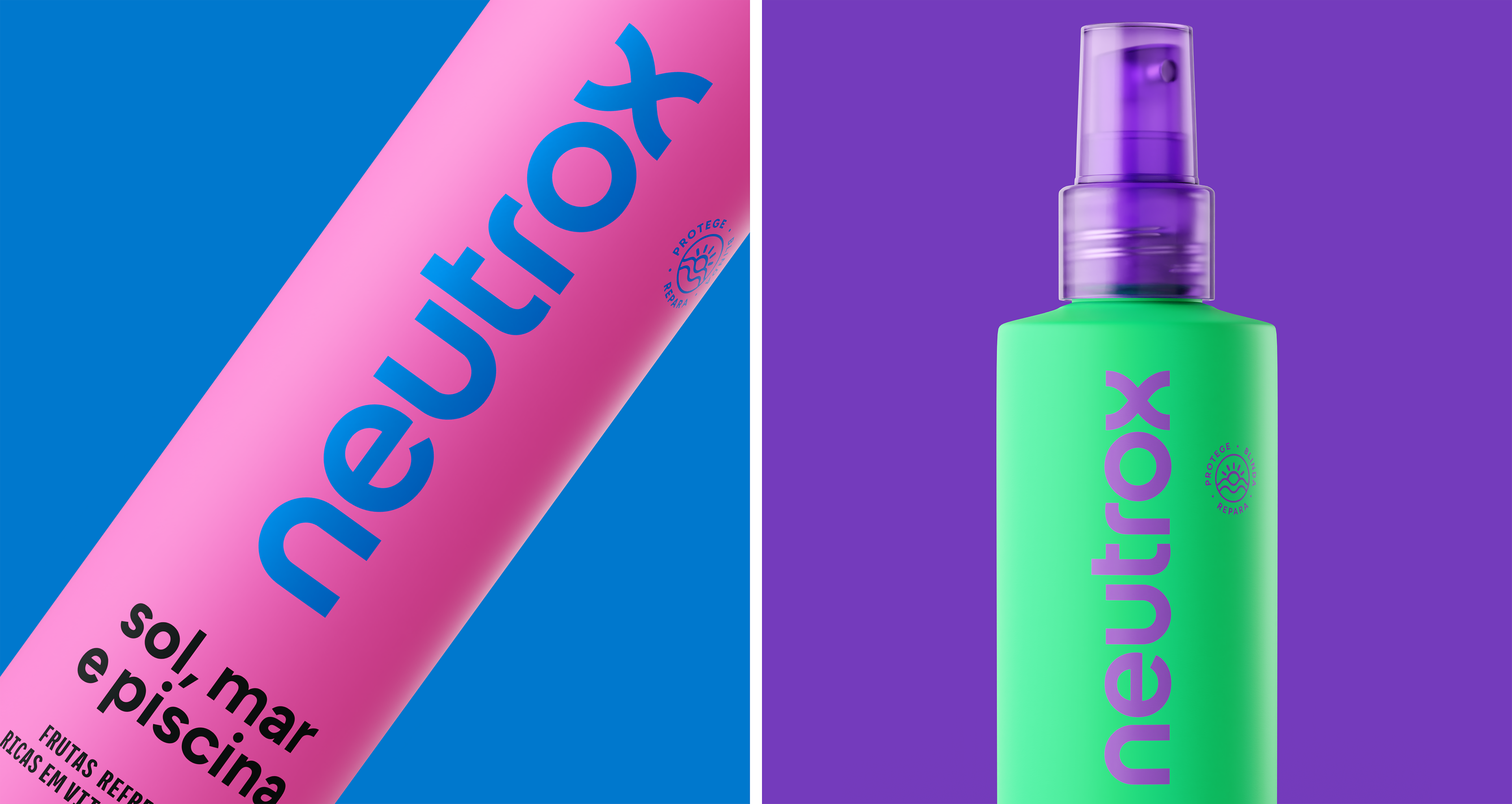
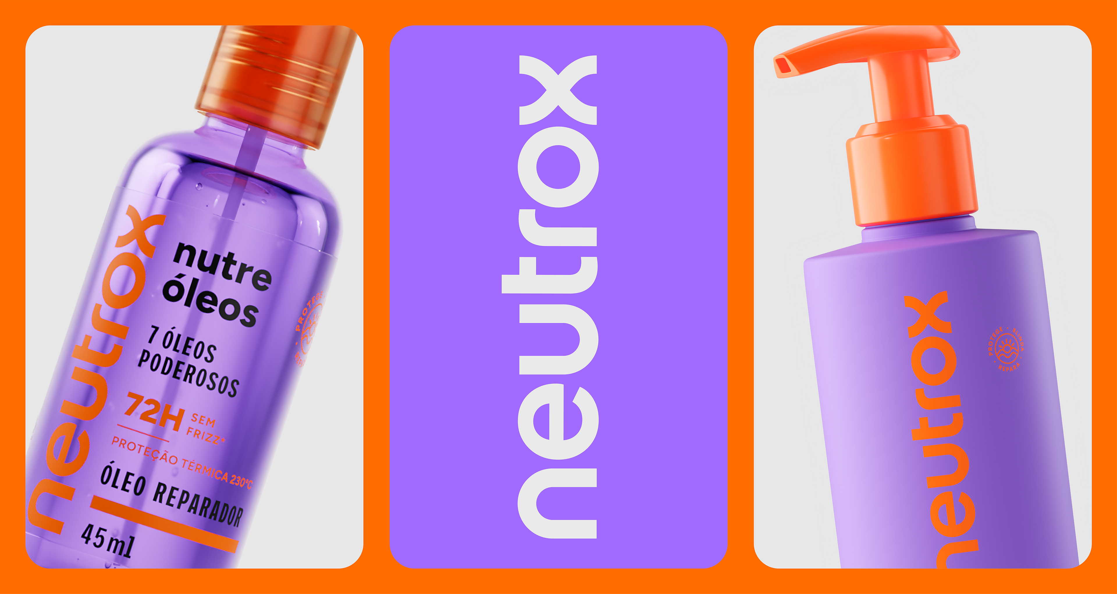
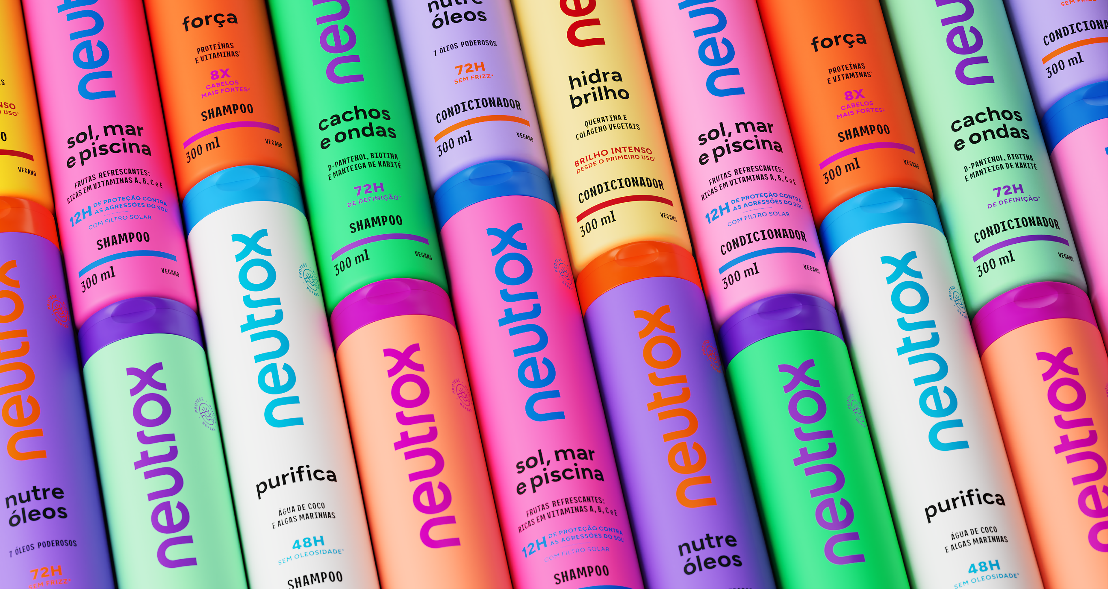
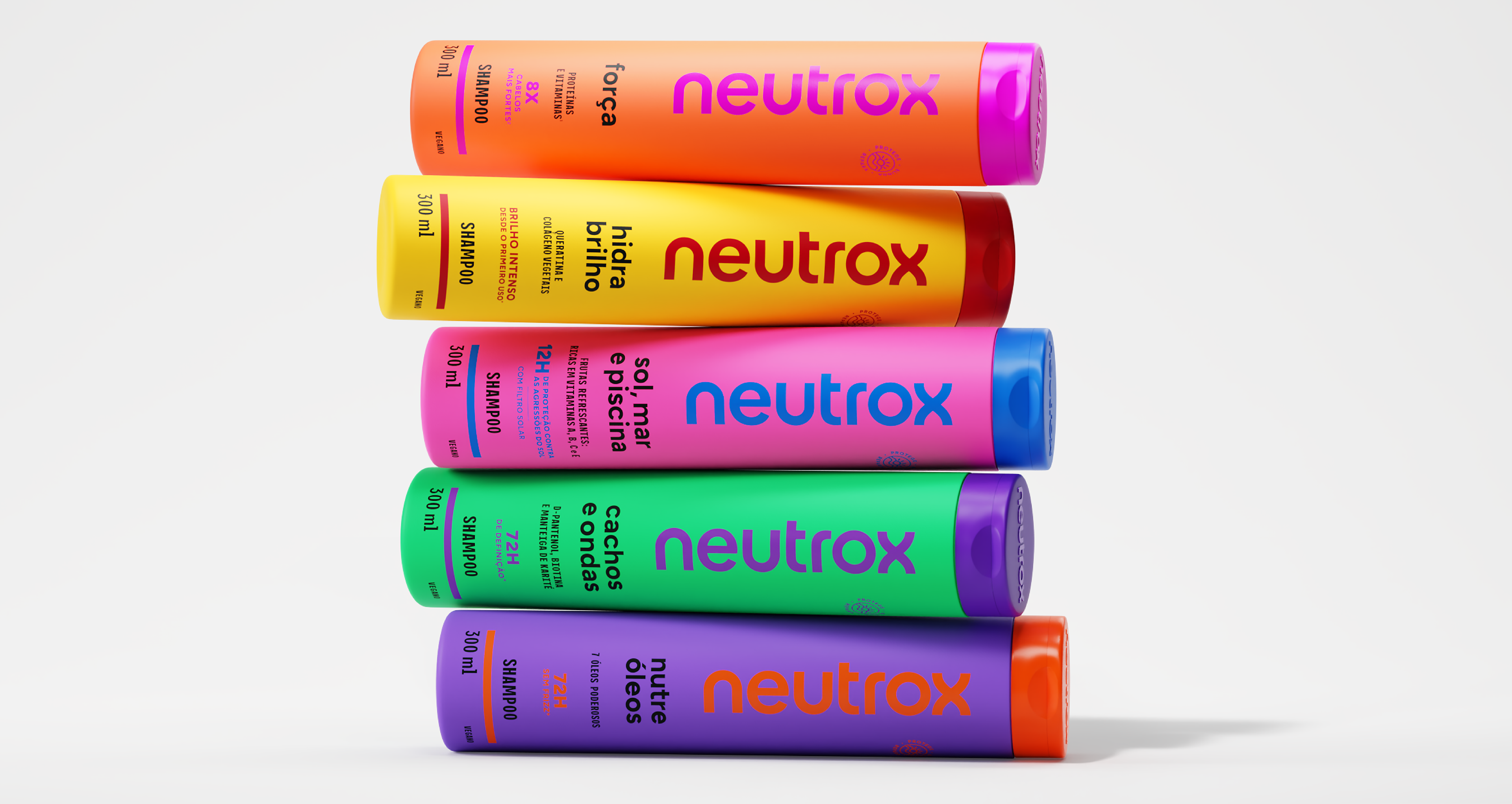
Partimos de um olhar atento para o imaginário construído pela embalagem original, buscando reinterpretá-lo em vez de simplesmente resgatá-lo. O formato icônico dos frascos foi mantido, redesenhado para preservar a relação com o desenho inaugural, enquanto a linguagem visual evoluiu para uma estética mais minimalista. Desenvolvemos um sistema visual flexível e coerente, que organiza cores e informações com clareza e dá unidade às diferentes linhas. O resultado traduz a essência da marca em uma expressão clara, relevante e contemporânea.
Partimos de um olhar atento para o imaginário construído pela embalagem original, buscando reinterpretá-lo em vez de simplesmente resgatá-lo. O formato icônico dos frascos foi mantido, redesenhado para preservar a relação com o desenho inaugural, enquanto a linguagem visual evoluiu para uma estética mais minimalista. Desenvolvemos um sistema visual flexível e coerente, que organiza cores e informações com clareza e dá unidade às diferentes linhas. O resultado traduz a essência da marca em uma expressão clara, relevante e contemporânea.
Neutrox is one of the most iconic brands in the Brazilian hair care market. Launched in the late 1970s, it helped popularize the conditioner in the country and became part of the emotional memory of generations. Over the decades, it has undergone several redesigns and expansions, today reaching several lines with dozens of packages. Foresti Design was invited to redesign the brand, the identity and the entire packaging system, reorganizing the portfolio and creating a current base capable of differentiating the products at the point of sale and repositioning Neutrox as a more desired brand.
We started with a close look at the imagery built by the original packaging, seeking to reinterpret it instead of simply rescuing it. The iconic shape of the bottles was maintained, redesigned to preserve the relationship with the inaugural design, while the visual language evolved towards a more minimalist aesthetic. We developed a flexible and coherent visual system, which organizes colors and information clearly and gives unity to the different lines. The result translates the essence of the brand into a clear, relevant and contemporary expression.
We started with a close look at the imagery built by the original packaging, seeking to reinterpret it instead of simply rescuing it. The iconic shape of the bottles was maintained, redesigned to preserve the relationship with the inaugural design, while the visual language evolved towards a more minimalist aesthetic. We developed a flexible and coherent visual system, which organizes colors and information clearly and gives unity to the different lines. The result translates the essence of the brand into a clear, relevant and contemporary expression.